In today’s era of booming online advertising, traditional methods like billboards still wield substantial effectiveness. While driving, we often encounter numerous billboards, but only a handful manage to truly catch our eye. An effectively crafted advertisement using the right billboard fonts has the power to stand out, leaving a lasting impression and boosting sales. Even if your message is compelling, choosing the wrong fonts can cause it to go unnoticed by passersby.
Picture this: a driver navigating a busy road, glimpsing at a billboard while cruising at speed. They have just a few seconds to take in the message. That’s why it’s crucial to ensure the design is visually appealing, with the best billboard fonts making it easy to read within that brief timeframe.
To guide you in selecting the ideal fonts for your billboard, consider the following tips.
Simple Fonts Reign Supreme in Billboard Design
Choose simple fonts for your billboard; ones that are easy to read from both short and long distances. Avoid capital letters and make sure there’s enough space between each letter for clarity. Letters that are too spread out or too close together can make your message confusing.
While fancy fonts might be visually appealing on paper, they’re a big no-no for billboard advertising. Thin and elaborate fonts are hard to decipher from a distance, especially at higher speeds for passing vehicles. Your message needs to be legible for both slow pedestrians and fast-moving cars.
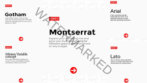
Opt for Sans Serif fonts like Arial, Calibri, Verdana, Tahoma, and Helvetica for your billboards. These fonts are simple, modern, and easily understandable, making them the ideal choice for effective billboard designs.
In the world of design, the best fonts are not just letters; they’re the silent storytellers that speak volumes with simplicity and elegance
“Great fonts in design aren’t just letters; they’re like silent storytellers, eloquent in simplicity and elegance.”

Optimal Font Sizes for Impact
For billboard ads, go big with your font sizes to ensure the message is visible from a distance and effectively utilizes white space. Keep it concise with a compelling message of 7-10 words, avoiding text overload. Remember to adjust the font size according to the display size, considering the difference between a 6-sheet unit and a large 96-sheet roadside billboard.
Vibrant Colors and Font Wisdom for Billboards
Say no to soft pastels for your billboard; opt for bold, attention-grabbing colors like green, black, red, yellow, or orange with high contrast to captivate onlookers. Ensure your image complements these colors and fonts for a striking design.
Steer clear of disliked fonts in billboard ads, especially those with narrow letter-spacing or overly complex styles. Serif fonts fall into this category, being intricate and impractical for quick readability at a distance.
Even in the digital realm, font choice matters for billboard success. Avoid fancy fonts, as readability is crucial for both fast-moving traffic and pedestrians. Opt for simple, modern fonts like Arial, Calibri, Verdana, Tahoma, and Helvetica Sans Serif.
In the world of billboard font colors, contrast is key. Rule out soft pastels and embrace bold, high-contrast colors like green, black, red, yellow, and orange. These combinations ensure your billboard stands out and grabs attention effectively.


